ChatGPT
 Gemini
 Perplexity
 Claude
 Grok
Grok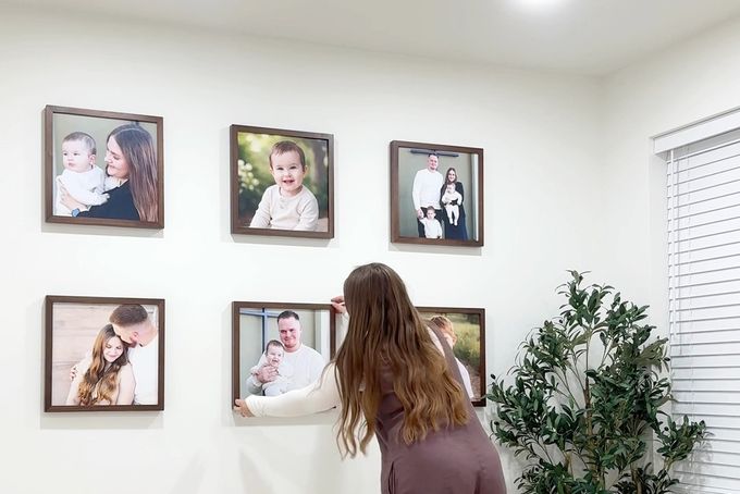
Every home has that one blank wall that feels like it's waiting for something. A gallery wall is an easy way to fill it meaningfully, whether that's a close-up of your kids laughing or a collection of family moments that make you smile every time you walk past.
The thing is, gallery wall ideas online often make the process look easy. Then you start hanging frames and realize the spacing feels off, the pieces don't quite work together, and the effortless look you had in mind suddenly takes a lot more planning.
This guide covers 11 gallery wall layouts, where each one works best, and the common mistakes to avoid.
Why Your Gallery Wall Layout Matters More Than You Think
Your layout shapes how a room feels, how light moves across the wall, and how your personal pieces relate to one another.
People form firm judgments about a space within 90 seconds of walking in, so your walls are doing more work than you might think [1].
The Two Layout Families
Symmetrical layouts:
- Create calm and balance.
- Works well in formal or minimalist rooms.
- Reinforce architectural symmetry.
Asymmetrical layouts:
- Create movement and visual energy.
- Adapt easily as your collection grows.
- Feel at home in eclectic or transitional interiors.
What to check before you pick a layout
- Your display should span 60% to 75% of the furniture width beneath it. So if your sofa is 80 inches wide, your gallery wall should be somewhere between 48 and 60 inches wide.
- The centre of your layout should sit 57 to 60 inches from the floor. That's the standard museum hanging height, and it's the sweet spot for most rooms.
- If your wall gets harsh afternoon sunlight, consider using UV-protected glass like that from FrameForest in your frames. Standard glass will create glare and can fade your photos over time.
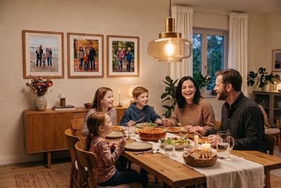
- If the wall is in a dining room or a cosy den where people are mostly seated when they look at it, hang the display a few inches lower so it sits comfortably at eye level from a chair rather than from a standing position.
11 Gallery Wall Layout Ideas for a Flawless Display
1. The Oversized Portrait Wall
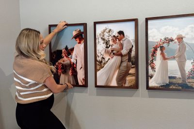
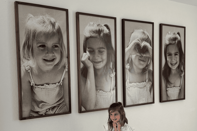
This layout features three to four large vertical frames, typically in the 20 by 30 or 22 by 44 size, hung side by side in a single row.
What to put in it and how to frame it
- Close-up portraits of children or family members work best here. The bigger the print, the more impact the expression has.
- Black and white prints give the display a timeless feel without competing with the room's colors.
- Individual portraits of each child hung side by side are one of the most popular approaches.
- Walnut or oak frames complement the warmth of the photos without overpowering them.
- You don't need a mat border at this size.
Common Mistake | How to Fix It |
|---|---|
Using low-resolution photos that look pixelated at large print sizes. | Always check your image resolution before ordering to make sure that your photo is ready for a large-format print. |
2. The 9 Square Grid
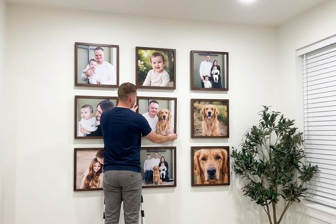
With this layout, nine square frames are arranged in a clean three-by-three block, each one holding a different family moment, all lined up perfectly on the wall. It sounds simple because it is, and it's why it works.
What to put in it and how to frame it
- Use 13 by 13 or 16 by 16 frames to keep the grid feeling substantial on the wall.
- Stick to one frame finish across all nine frames, white or black, both look clean and cohesive.
- A mix of candid family moments, kids' close-ups, and wedding shots works beautifully together.
- Keep photos consistent in tone, either all color or all black and white, so the grid reads as one unified piece.
Common Mistake | How to Fix It |
|---|---|
Mixing frame finishes or photo styles so the grid looks mismatched. | Choose one frame finish and one photo treatment across all nine frames before you start. |
3. The Wrapped Canvas
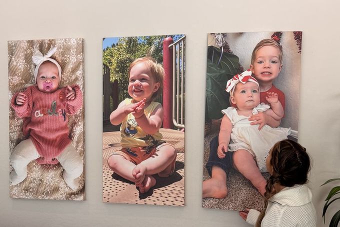
This is a modern, gallery-style look where the image wraps around the edges of the canvas and stands completely on its own. It's one of the simplest ways to make a single photo feel like a genuine piece of art.
What to put in it and how to frame it
- Large, emotionally powerful images work best here: a close-up of your child's face, a wedding moment, or a candid family shot that captures a real feeling.
- The image needs to be strong enough to hold attention on its own since there's no frame to create separation.
- Group two or three wrapped canvases in a row for a clean, modern display that feels intentional without being complicated.
- Works well alongside framed pieces in a corner or staircase arrangement for added depth and texture.
Common Mistake | How to Fix It |
|---|---|
Choosing a photo that's too busy at the edges, since the wrap pulls part of the image around the sides. | Pick photos where the main subject sits centrally, so nothing important gets lost around the edges. |
4. The Triptych
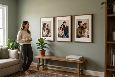
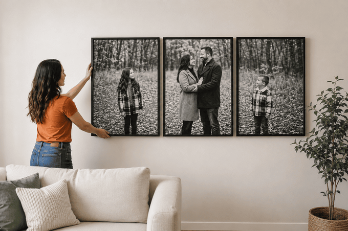
The Triptych works best above low-profile furniture like a sofa, bed, or credenza, where you want something that feels considered and complete without being complicated.
It's a natural fit if you have a contemporary and minimalist design style, and it gives one strong, clean statement.
What to put in it and how to frame it
- Three portraits of your children, one per frame, work beautifully and feel deeply personal.
- Black and white prints in oak or walnut frames give it a timeless look.
- Color portraits in white or maple frames feel warmer and more playful.
- If you'd like to add a mat border, make sure it's an oversized mat border with a consistent width on all four sides.
Common Mistake | How to Fix It |
|---|---|
Frames hanging at uneven heights that break the clean horizontal line. | Before you hammer in any nails, measure how far the hanging wire drops from the top of each frame. That way, all three pieces line up perfectly. |
5. The Asymmetrical Cluster
The Asymmetrical Cluster is one of the easiest layouts to make your own. It works beautifully on staircases, in long hallways, or on large living room walls where a rigid grid would feel too formal.
It's the go-to choice if you want a warm, collected feel that looks like it came together naturally over time.

What to put in it and how to frame it
- Mix family portraits, kids' close-ups, and wedding moments freely across the arrangement.
- Use a single unified frame finish across everything, like all matte black or all natural oak, to tie different types of imagery together.
- Alternate vertical and horizontal frame orientations as you build outward.
- Use a 2.5-inch cardboard square as a physical spacer to keep gaps consistent.
Leslie Ferguson-Yep, Interior Design Content Strategist
Common Mistake | How to Fix It |
|---|---|
Clustered large frames on one side, making the whole wall look lopsided. | Place your largest frame slightly off-centre first, then spiral outward clockwise. |
6. The Vertical Stack
Sometimes you don't have a wide wall to work with, and that's exactly where the Vertical Stack shines.
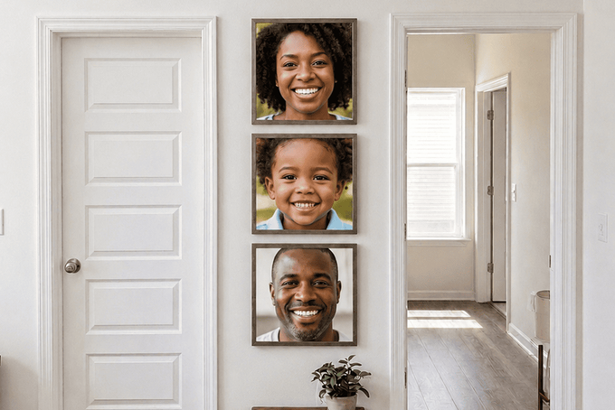
Three to four frames arranged in a clean vertical column draw the eye upward rather than across, making it one of the smartest options for narrow strips of wall between doorways, structural pillars, or compact rooms where horizontal space is limited.
What to put in it and how to frame it
- Close-up portraits of your child across different ages work beautifully here; it tells a story from bottom to top.
- White or maple frames keep the look light and clean.
- You can add an oversized mat border to give each print a gallery feel without needing a large frame.
- The smallest frame to use here is 8 by 10, so nothing looks too small against the wall.
Common Mistake | How to Fix It |
|---|---|
Hanging the grouping too high or too low, which throws off the room's proportions. | Work from the centre outward. The middle frame's center should sit at 57 to 60 inches from the floor, then build up and down from there. |
7. The Staircase Cascade
Staircases are one of the most used spaces in a home, but they're easy to forget when decorating.
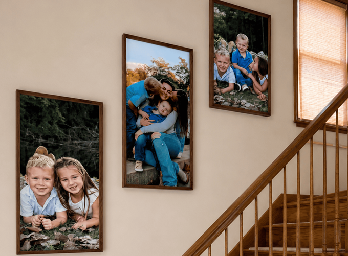
The Staircase Cascade layout helps turn this area into a personal display by following the natural slope of the stairs. Because you pass it multiple times a day, it will become one of the most meaningful gallery walls in your house.
What to put in it and how to frame it
- Frames in the 10 by 12 or 12 by 16 range are large enough to appreciate up close as people move past.
- Uniform walnut or oak-framed canvas creates continuity along the diagonal.
- Keep mat borders slim and consistent on all four sides so the focus stays on the imagery.
- Every FrameForest frame comes with a sawtooth hanger that requires just one nail, which keeps things clean and secure on staircase walls.
- Add rubber bumper pads to the lower frame corners to prevent shifting from foot traffic vibration.
Common Mistake | How to Fix It |
|---|---|
Measuring from individual stair treads, which results in an uneven, irregular pattern. | Run painter's tape parallel to the handrail at a fixed height of 57 inches. Use this as your centre axis and maintain an exact 3-inch gap between the side edges of each successive frame. |
8. The Salon Wall
This is a layered mix of frames arranged around one standout focal piece, which, most of the time, is an ornate mirror.
It works best in a living room, a reading nook beside an armchair, or a formal entryway where you want guests to stop and take it all in. Place it where indirect morning or golden-hour light can hit it, since natural light brings out the warmth of mixed-finish frames beautifully.

What to put in it and how to frame it
- Mix family portraits, kids close-ups, and wedding moments across the arrangement.
- Mix frame finishes across black, oak, and walnut for an authentic gathered look.
- Keep a shared color thread through the photos themselves, either all color or all black and white, so the mixed finishes feel intentional rather than random.
- Maintain a gap of no more than 1.5 to 2 inches between frames so it reads as one cohesive cluster rather than scattered individual pieces.
Common Mistake | How to Fix It |
|---|---|
Frames are placed too far apart, or greenery covers the artwork entirely. | Anchor the central focal piece first, then build outward. You should treat the greenery as an architectural trim, not decoration, and keep it from blocking personal pieces. |
9. The Photo Ledge
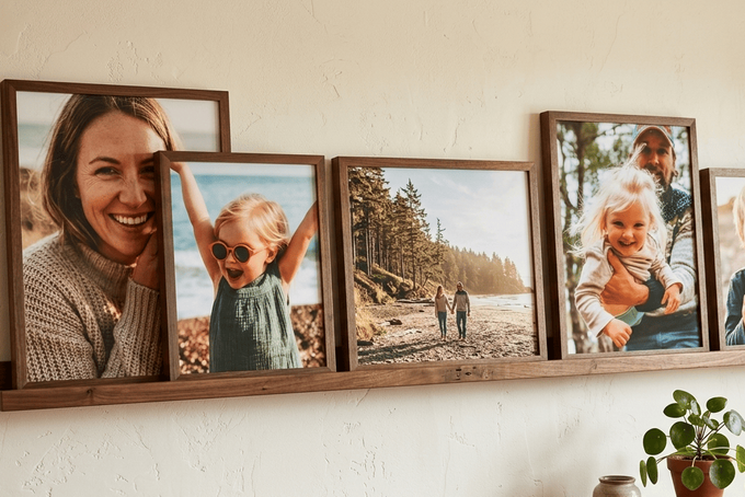
The Photo Ledge swaps individual wall hooks for a single long shelf mounted level across the wall, with frames leaning and layering on top rather than hung one by one.
It's one of the most practical living room gallery wall ideas you can use for open-plan spaces, and one of the best options if you're renting.
What to put in it and how to frame it
- Mix at least three distinct frame sizes, for example, 8 by 10, 12 by 16, and 16 by 12, to create variety in height across the shelf.
- Pair frames in different finishes, like black alongside oak or walnut, to build texture without looking mismatched.
- Mix mat styles: some frames with an oversized mat border, some without, for a natural high-low rhythm.
- Use the overlap rule: place a smaller frame slightly in front of a larger one, overlapping by 1 to 2 inches, to create layered depth.
Common Mistake | How to Fix It |
|---|---|
Lining up frames of identical size so the shelf looks flat and retail-like. | Always use at least three frame sizes and apply the overlap rule so pieces layer in front of one another rather than sitting in a flat row. |
10. The Pinwheel
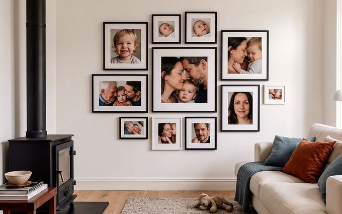
The Pinwheel is one of those layouts that looks effortless once it's up but takes a little planning to get right. Frames of different dimensions are arranged tightly together to form one clean rectangular block on the wall, with each frame interlocking around a central point.
What to put in it and how to frame it
- A mix of close-up kids portraits and candid family moments works beautifully here since the varying frame sizes give each photo its own moment.
- Use a single wood tone across all frames, raw light maple or white, for a unified look despite the varying dimensions
- Give every frame a matching wide white oversize mat border so different image sizes don't compete with each other.
- Cut a 2-inch cardboard block to use as a physical spacer and never estimate gaps by eye.
Common Mistake | How to Fix It |
|---|---|
There are uneven gaps between frames, causing the interlocking effect to dissolve. | Maintain an absolute 2-inch spacing rule between every frame border and always use a physical cardboard spacer rather than guessing. |
11. The Corner Gallery
Most gallery walls stop at the edge of one wall. The Corner Gallery keeps going.
It wraps across two adjoining walls, turning a hard corner into one continuous visual experience. It's ideal for reading nooks, home offices, hallways, and any space where a single-wall layout would feel too small or incomplete.
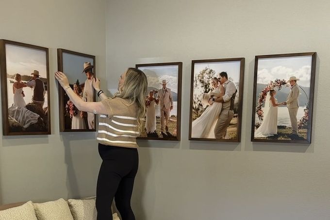
What to put in it and how to frame it
- Use at least one consistent element across both walls, a shared frame finish, or consistent mat style, to keep the two sides feeling connected.
- Place one anchor piece within 6 to 12 inches of the corner first, then build outward on both walls simultaneously.
- Allow one or two pieces nearest the corner to act as bridge elements linking both sides.
- FrameForest's oak and walnut finishes work particularly well here since the natural wood grain visually connects two separate wall surfaces.
Common Mistake | How to Fix It |
|---|---|
Treating each wall as a separate composition, so the corner looks accidental rather than deliberate. | Start at the corner, not the edges. Place your anchor piece near the corner first and build outward on both sides simultaneously, treating the corner itself as the visual centre. |
Choosing the Right Layout for Your Home
The simplest way to decide is to learn what you want to get out of the layout. For example:
- If you want a bold, emotional statement, go with the Oversized Portrait Wall.
- If you want something clean and symmetrical, the 9 Square Grid is your best bet.
- If you prefer a modern, frameless look, try the Wrapped Canvas.
- If you want order and calm above a sofa or bed, go with the Triptych or the Pinwheel.
- If you want warmth and personality, the Asymmetrical Cluster works beautifully.
- If you're working around a tricky space, the Vertical Stack or the Staircase Cascade is the right option.
- If you're renting or still building your collection, the Photo Ledge is the most flexible choice.
- If you're working around awkward corners or broken-up walls, the Corner Gallery is best-suited.
Find the Layout That Feels Like Home
Whatever you choose, start with your wall, not the trend. Measure what you have, note the light, consider the furniture beneath it, and let your actual collection guide the format.
A gallery wall doesn't have to be finished to be beautiful. Some of the most personal displays are the ones still making room for what comes next. When you're ready to bring it all together, FrameForest helps you turn those moments into custom-framed pieces that fit your space and your story.
FAQs
What's a gallery wall, and why should I consider one?
It's a collection of frames, artwork, mirrors, or objects arranged together on a wall to create one unified display. Beyond filling empty space, it establishes a focal point, adds personality, and turns your walls into a personal timeline of the moments that matter most to you.
What gallery wall layout's best for a living room?
For wide walls above a sofa, the Triptych makes a powerful statement. For something warmer and more eclectic, the Asymmetrical Cluster or Salon Wall both work beautifully. As a general rule, your display should span 60% to 75% of the furniture width beneath it.
How high should I hang a gallery wall?
The centre of your layout should sit around 57 to 60 inches from the floor, which is standard museum hanging height. If the display is mainly viewed while seated, drop it slightly lower so it feels comfortable at eye level from where people actually spend their time.
Can I create a gallery wall in a rental?
Absolutely. The Photo Ledge is one of the best gallery wall layout ideas for renters since it only requires one shelf installation rather than multiple nail points. When you do need anchors, thin-pin picture hooks leave far smaller marks than adhesive strips.
How do I stop my gallery wall from looking chaotic?
Consistent spacing is your best tool. Maintain a 2 to 3 inch gap between every frame and cut a cardboard spacer to that measurement rather than estimating by eye. If your frames vary widely in style, unifying them with a single frame finish or mat color will bring everything together.
How do I know when my layout is ready?
Try the Squint and Stride test. First, have your frames arranged on the floor before hanging. Then take a photo on your phone and switch it to black and white. Removing the color makes it easier to spot any imbalances in visual weight or spacing before you commit to the wall. Then, once everything is hung, step back at least 10 feet, squint until the details blur into basic shapes, and check whether it feels balanced. If your eye moves smoothly across the whole layout without getting stuck on an awkward gap or heavy spot, your layout is ready.
References
Doucet, E. G. (n.d.). Winnipeg architecture: University of Winnipeg modern. winnipegarchitecture.ca
Hoang, P., King, J. A., Moore, S., Moore, K., Reich, K., Sidhu, H., Tan, C. V., Whaley, C., & McMillan, J. (2022). Interventions associated with reduced loneliness and social isolation in older adults: A systematic review and meta-analysis. JAMA Network Open, 5(10), e2236676. jamanetwork.com