ChatGPT
 Gemini
 Perplexity
 Claude
 Grok
Grok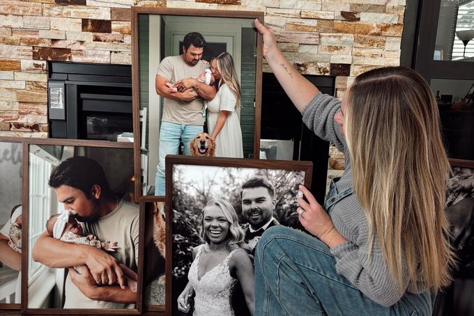
Your living room is the most used space in your home. It's where you entertain, unwind, and spend most of your time, so the walls should feel as good as the room itself. A well-laid-out gallery wall here isn't just decoration. Done right, it tells a story, starts conversations, and ties the whole room together.
The thing is, most homeowners either play it too safe with generic prints or go too big and end up with something that feels cluttered rather than curated. This guide covers seven living room gallery wall ideas you could use to make a statement.
What Makes a Living Room Gallery Wall Work
Before you start designing, keep in mind that a living room gallery wall lives or dies by two things:
Scale: Frames that are too small for the wall look like an afterthought.
Negative space: Frames crammed too close together look cluttered.
Getting both right is what separates a display that feels curated from one that just feels busy.
What to Think About Before You Pick a Layout
- Your display should span 60% to 75% of the width of the furniture beneath it. So if your sofa is 80 inches wide, your gallery wall should sit somewhere between 48 and 60 inches wide.
- The bottom edge of your lowest frame should hang 6 to 8 inches above the top of your sofa or credenza so the display feels anchored to the furniture rather than floating above it.
- The center of your overall layout should sit at standard eye level, around 57 to 60 inches from the floor.
- Leave at least 2 to 3 inches of consistent spacing between every frame. Inconsistent gaps are the fastest way to make any layout look unfinished.
- Always use specialized glass that will keep your frames protected from harsh lighting. FrameForest frames come with UV-protected glass, which reduces glare from lamps and natural light and keeps your photos safe over time.
Deciding between symmetrical and asymmetrical
Symmetrical layouts:
- Work best in minimalist, contemporary, or formal living rooms.
- Create an immediate balance and architectural structure.
- Must have identical frame sizes and consistent matting throughout.
Asymmetrical layouts:
- Work best in eclectic, transitional, or casual living rooms.
- Feel warm and collected rather than staged.
- Accommodate different frame sizes, orientations, and mixed media.
7 Best Living Room Gallery Wall Ideas
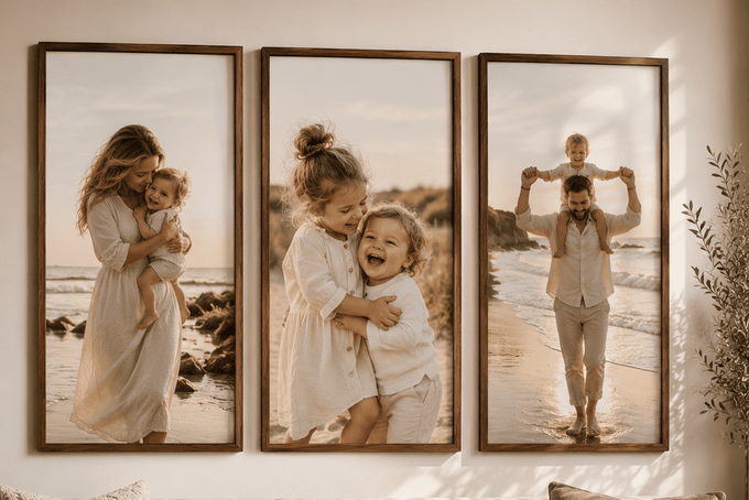
1. The Oversized Portrait Wall
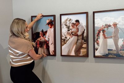
With this layout, three to four large vertical frames should be hung side by side on the main living room wall or above a sofa.
What to put in it and how to frame it
- Close-up portraits of children or family members work best here; the bigger the print, the more impact the expression has. It's one of the most personal things you can put in a living room and one of the most striking.
- Black and white prints give the display a timeless feel that suits almost any living room.
- Individual portraits of each child hung side by side are one of the most popular approaches.
- Walnut or oak frames complement the warmth of the photos without competing with the room.
Also, try to always start with a high-resolution photo. At 20 by 30 or 22 by 44 inches, image quality matters more than anything else.
Common Mistake | How to Fix It |
|---|---|
Using low-resolution photos that look pixelated at large print sizes. | Check your image resolution before ordering so you know the photo is ready for a large-format print. |
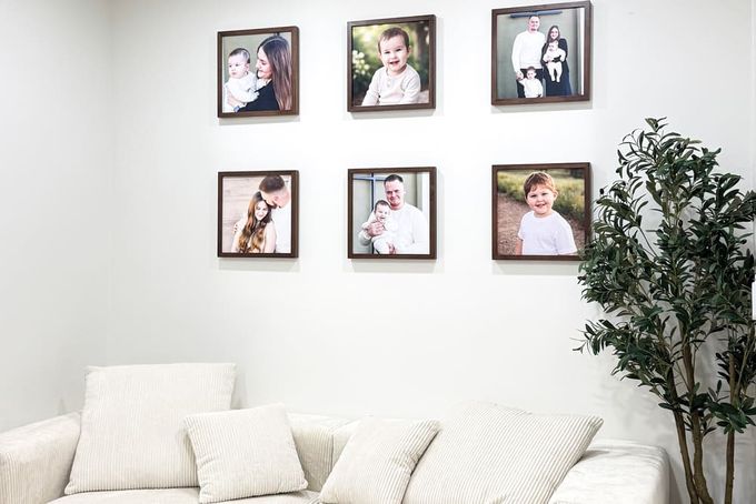
2. The Symmetrical Grid
With this layout, a set of identical frames should be arranged in a clean, even block, either a two-by-three or three-by-three formation. The number of frames used depends on your wall size.
Every frame should line up, and with the spacing consistent, the whole display will read as one organized unit.
What to put in it and how to frame it
- Use 13 by 13 or 16 by 16 square frames to keep the grid feeling substantial on the wall.
- Close-up family portraits, kids' candids, and wedding moments work beautifully together in the grid format.
- Keep photos consistent in tone, either all color or all black and white.
- Black or walnut frames give the grid a high-contrast, polished look.
- Lock spacing at exactly 2 inches between every single frame edge.
Common Mistake | How to Fix It |
|---|---|
Hanging frames by eye so one sits slightly out of alignment, breaking the entire grid effect. | Cut a 2-inch block of rigid cardboard to use as a physical spacer between every frame rather than estimating by eye. |
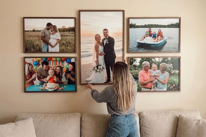
3. The Asymmetric Cluster
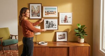
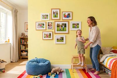
With this layout, you can arrange frames of different sizes in a relaxed, free-form way around one larger anchor piece.
It's warm, flexible, and looks like it came together naturally over time. It works beautifully above a sofa, on a large accent wall, or anywhere a rigid grid would feel too formal.
What to put in it and how to frame it
- Mix family portraits, kids' close-ups, and wedding moments freely across the arrangement.
- Use one frame finish across everything, all oak or all black, to keep the varied sizes balanced.
- Place the largest frame slightly off-center first, then build outward, maintaining a consistent 2 to 3 inch gap between every piece.
- Make sure the central anchor piece is roughly 40% larger than the surrounding frames so the eye has a clear starting point.
- Hang the bottom edge of the layout 6 to 8 inches above the top of your sofa.
- Stick to frames no smaller than 8 by 10 so nothing gets lost in the arrangement.
When it comes to family photos, they do more than fill a wall. Seeing meaningful moments every day helps us feel connected to the people and experiences we value most [1].
Common Mistake | How to Fix It |
|---|---|
When surrounding frames are too close in size to the anchor piece, the eye wanders with no clear focal point. | Make sure your central piece is much larger than everything around it. The size difference is what creates hierarchy and holds the whole arrangement together. |
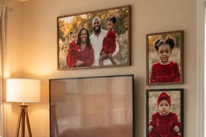
4. The TV Surround
With this layout, frames are arranged around a wall-mounted TV, turning the screen from an awkward focal point into part of a larger, cohesive display.
Instead of letting the television dominate the wall, the surrounding frames bring warmth and personality to the space and make the whole arrangement feel intentional.
What to put in it and how to frame it
- Use a mix of frame sizes around the TV, combining vertical and horizontal orientations for a natural, organic feel.
- Family portraits, kids close-ups, and wedding moments work well here since the personal imagery softens up the look.
- Walnut or black frames echo the dark tones of the television and help it blend into the display.
- Maintain at least 3 inches between the outer edge of the TV and the nearest frame so nothing feels too cramped.
- Build a balanced arrangement on at least two or three sides of the screen so the TV sits within the display rather than dominating it.
- Stick to frames no smaller than 8 by 10 so nothing gets visually crushed by the size of the screen.
Avoid placing frames directly next to the TV's ventilation vents and keep frames far enough from the screen that the light from the TV doesn't create distracting reflections on the glass.
Common Mistake | How to Fix It |
|---|---|
Frames are only on one side of the TV or are too small to balance the size of the screen. | Build a balanced C-shape or full envelope of frames around at least two or three sides of the screen. |
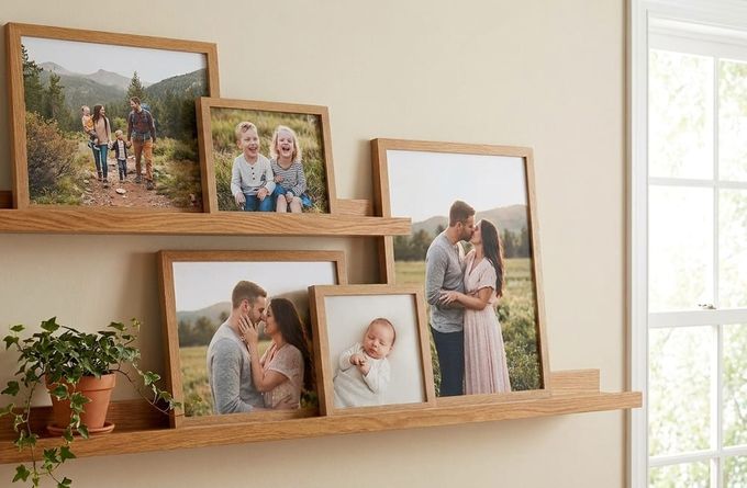
5. The Lean-In Shelf Ledge
With this layout, one or two long floating shelves are mounted on the wall with frames leaning and layering on top rather than hung individually.
It's one of the most flexible living room gallery wall ideas because you can rearrange and refresh the display without touching the wall again.
What to put in it and how to frame it
- Mix at least three distinct frame sizes to create variety in height across the shelf.
- Use the overlap rule: place a smaller frame slightly in front of a larger one, overlapping by 1 to 2 inches, to create layered depth.
- Mix some frames with an oversized mat border and some without for a natural high-low rhythm.
- Add a small keepsake or trailing plant on the ledge to break up the hard lines of the frames.
- If using two shelves, make sure the tallest frame on the bottom shelf extends high enough to break past the horizontal line of the upper shelf, creating a visual connection between the two levels.
Common Mistake | How to Fix It |
|---|---|
All frames are the same height, so the shelf looks flat and retail-like rather than layered and personal. | Always use at least three different frame sizes and apply the overlap rule so pieces layer naturally in front of one another. |
6. The Wrapped Canvas
With this layout, there's no frame, no mat border, just the photo bold and uninterrupted on the wall. It's a clean, modern option that works beautifully in a living room because the image speaks entirely for itself.
Group two or three wrapped canvases in a simple row for a strong, unified display, or use one large canvas as a standalone statement piece alongside a more complex arrangement elsewhere in the room.

What to put in it and how to frame it
- A large close-up of your child's face, a wedding moment, or a candid family shot works best here.
- The image needs to be strong enough to hold attention on its own since there's nothing around it.
- Keep the main subject centered in the photo so nothing important gets lost around the wrapped edges.
- Two or three canvases in a row create a clean, contemporary display without needing a lot of wall space.
- Works well alongside framed pieces in a mixed arrangement for added texture and depth.
Common Mistake | How to Fix It |
|---|---|
Choosing a photo where the subject sits too close to the edges, which causes important details to wrap around the sides. | Always center your subject before ordering and check the preview carefully before confirming. |
7. The Corner Wrap
With this layout, frames are arranged across two adjoining walls, turning a hard corner into one continuous visual experience.
It's ideal for living rooms where a traditional single-wall layout would feel too small or incomplete, and it works especially well beside a sectional sofa, around a reading armchair, or connecting the living room to an adjacent hallway.

What to put in it and how to frame it
- Use at least one consistent element across both walls, a shared frame finish, or consistent mat style, to keep the two sides feeling connected.
- Place one anchor piece within 6 to 12 inches of the corner first, then build outward on both walls simultaneously.
- Allow one or two pieces nearest the corner to act as bridge elements linking both sides.
- Oak and walnut finishes work well here since the frames' natural wood grain visually connects two separate wall surfaces.
- Maintain consistent spacing across the corner.
Common Mistake | How to Fix It |
|---|---|
Treating each wall separately so the corner looks accidental rather than deliberate. | Start at the corner, not the edges. Place your anchor piece near the corner first and build outward on both sides at the same time, treating the corner itself as the visual center. |
Choosing the Right Living Room Gallery Wall for Your Space
To decide which layout suits your living room, keep in mind that:
- If you want something bold and personal, go with the Oversized Portrait Wall.
- If you want something warm and collected that feels like it grew over time, try the Asymmetric Cluster.
- If you want one strong horizontal statement above a sofa, the Linear Row is your best bet.
- If you want to make your TV wall feel more personal, go with the TV Surround.
- If you're renting or want the flexibility to change things up, the Lean-In Shelf Ledge is the most practical choice.
- If you want a modern frameless look, the Wrapped Canvas is the right option.
- If you're working around awkward corners or broken-up walls, the Corner Wrap works beautifully.
Make Your Living Room Walls Feel Like Home With FrameForest
Whatever layout you choose, start with photos that actually mean something to you. Before you buy a single frame, trace your layout on kraft paper, tape it to the wall, and live with it for 48 hours. It will save you from getting the scale wrong or ending up with sizes that don't work in the space.
When you're ready, FrameForest makes it easy to turn your favorite family moments into custom framed pieces that feel right at home on any living room wall.
FAQs
What's the best living room gallery wall layout for above a sofa?
The Linear Row and the Oversized Portrait Wall both work beautifully above a sofa. As a general rule, your display should span 60% to 75% of the sofa's width and the bottom edge of the lowest frame should hang 6 to 8 inches above the top of the backrest.
How do I stop my living room gallery wall from looking cluttered?
Consistent spacing is your best tool. Maintain a 2 to 3 inch gap between every frame and use a physical cardboard spacer rather than estimating by eye. Sticking to one frame finish across the whole display also helps pull everything together without extra effort.
Can I create a living room gallery wall around my TV?
Yes, and it's one of the best ways to make a media wall feel more personal. Use walnut or black frames to echo the dark tones of the screen, build frames on at least two or three sides of the TV, and maintain at least 3 inches between the screen edge and the nearest frame.
What photos work best in a living room gallery wall?
Close-up portraits of children, wedding moments, and candid family shots work best. The living room is a shared, high-visibility space so the images should feel personal and conversation-starting rather than generic. Black and white photos are a popular choice because they unify very different types of imagery without competing with the room's color palette.
Should I go symmetrical or asymmetrical?
It depends on your living room style. Symmetrical grids work best in contemporary, minimalist, or formal spaces where clean lines are already part of the aesthetic. Asymmetrical clusters work best in eclectic, transitional, or casual spaces where a warmer, more collected feel is the goal.
References
Czyżowska, N., & Gurba, E. (2021). Does reflection on everyday events enhance meaning in life and well-being among emerging adults? Self-efficacy as mediator between meaning in life and well-being. International Journal of Environmental Research and Public Health, 18(18), 9714. mdpi.com