ChatGPT
 Gemini
 Perplexity
 Claude
 Grok
Grok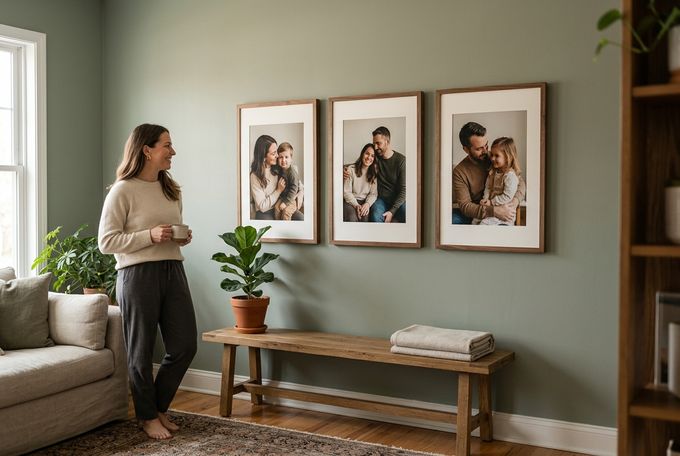
Ever walked into a coffee shop with a wall-sized menu and blanked on what to order? The same thing can happen on a gallery wall. When there's too much to look at, a wall meant to feel personal starts to feel like noise.
Research on household clutter backs this up. People who describe their living spaces as cluttered report measurably lower well-being than those who see their homes as calm and organized [1].
That's the problem minimalist gallery wall ideas solve. An understated wall trades volume for intention, choosing a few photos and giving each room to be seen. This guide covers what makes a wall and a frame feel minimal, then six ways to put that into practice.
What Makes a Gallery Wall "Minimal"?
Before getting into specific layouts, it helps to know what separates an intentionally simple wall from one that's simply small. Minimalism is about how deliberately you hang your frames rather than a specific number.
A few things tend to define this type of gallery wall:
- A limited number of pieces: Two frames or nine, the count stays intentional rather than growing photo by photo.
- Consistent spacing: Even gaps read as calm. Uneven ones read as cluttered, no matter how few frames are involved.
- One dominant color story: Whether that's black-and-white photography or a shared warm palette, a common thread across images keeps the eye from jumping around.
- Real negative space: The wall around the frames is part of the design, not a gap waiting to be filled.
What Makes a Picture Frame "Minimalist"?
Layout is only half the equation. The frames themselves either support an uncluttered look or work against it.
Clean Lines Over Ornate Detail
A minimalist picture frame comes down to restraint: clean lines, no carved or decorative detailing, and a slim profile that doesn't compete with the photo inside it. The frame's job is to support the image, not announce itself.
Ornate molding can be beautiful in the right room, but it pulls attention away from the photo. A streamlined frame gives the image structure without adding anything extra for the eye to process.
One Material and One Consistent Tone
Material and finish consistency matter just as much as shape. A single, natural material in one consistent tone reads as far more minimal than a wall mixing several colors or finishes. Uniformity does more visual work than the layout itself.
6 Minimalist Gallery Wall Ideas for a Clean, Serene Look
Restraint, not emptiness, is what makes a gallery wall read as minimalist. These six ideas treat open wall space as part of the design, not wasted space waiting to be filled.
1. The Same-Size Grid
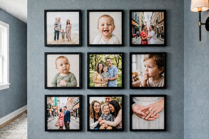
This is one of the simplest ways to bring order to a blank wall. Arrange nine equal-sized frames in three rows of three, evenly spaced and perfectly aligned.
Why It Works
Matching frame sizes and consistent gaps make a set of individually different photos read as one collection. This lines up with a well-established idea in visual perception. Elements that share size and sit close together get grouped into a single unit by the eye, rather than processed as separate pieces [2].
Best Photo Choices
Family portraits, wedding photos, or close-up shots of children work well here, especially when the images share a similar color palette or photography style.
Styling Tips
- Measure and mark placement before hanging a single frame. In a grid, even a half-inch difference in spacing is noticeable.
- Keep every frame the same finish. Mixing tones in a grid undercuts the "one collection" effect.
- Stick to either all color or all black-and-white photos so the grid reads as unified.
The FrameForest Touch
A 3x3 grid is one of the more popular ways FrameForest customers build a same-size layout. Matching solid wood frames in one finish give the arrangement a clean, finished look without needing anything else on the wall.
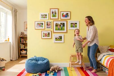
2. One Wood Tone, Mixed Frame Sizes
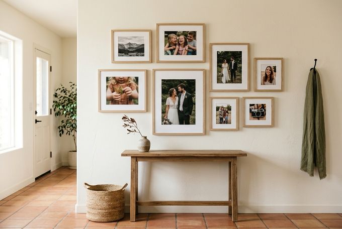
A handful of frames in different sizes, some square and some rectangular, feel unified rather than random if they all share the same wood tone.
Why It Works
Varying frame sizes usually reads as busy, but a single consistent wood tone pulls everything back together. The wall behind the arrangement does real work too. A plain or neutral wall keeps the wood grain and the photos as the visual focus, rather than competing with a patterned or brightly colored backdrop.
Best Photo Choices
A genuine mix works here. Candid family moments, close-up shots of kids, a wedding photo, and a landscape or travel image can all sit together as long as the frame finish stays consistent.
Styling Tips
- Choose one wood tone, such as walnut or oak, and use it across every frame regardless of size.
- Keep the wall itself plain. White, greige, or another neutral lets the wood grain read clearly.
- Vary frame sizes deliberately, not randomly. Group two or three sizes rather than five or six.
The FrameForest Touch
Natural wood-tone frames bring warmth to a neutral wall while keeping the gallery feeling clean. This approach also pairs well with a framed canvas piece for added texture. It's also a natural fit for a stairway gallery wall, where mixed frame sizes follow the slope of the stairs.
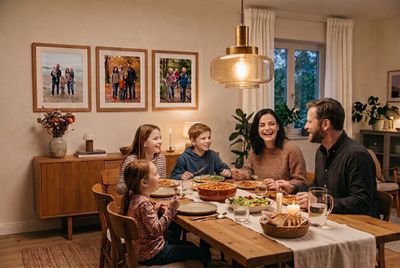
3. The Mirrored Symmetrical Layout
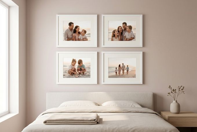
Create calm through symmetry. Arrange matching frames on either side of a center point, for example, using two pairs or four frames in a balanced block.
Why It Works
Symmetry reads as put-together almost automatically. Even with several photos on the wall, a symmetrical arrangement feels calm rather than busy, because the eye doesn't have to work to find the pattern.
Best Photo Choices
Family pictures, travel photos, or a set of images from the same event or trip work especially well, particularly when their tones are similar enough to reinforce the mirrored effect.
Styling Tips
- Keep every frame in the layout the same size and finish.
- Leave equal spacing on both sides of the center point. This is where small measurement errors show up fastest.
- Choose photos with a shared tone or color story so the two halves feel like a matched set—not two unrelated pairs.
The FrameForest Touch
Matching wood frames add warmth while keeping both sides visually connected. In a bright bedroom, FrameForest's painted white finish can make the symmetry feel even airier. It's a particularly good fit above a bed or console.
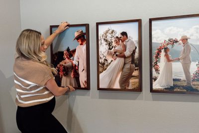
4. The Oversized Vertical Trio
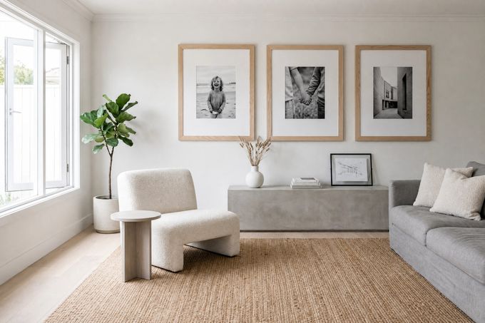
Three or four large vertical frames hung side by side in a single row often make more of an impression than a wall full of small ones ever could.
Why It Works
A large photograph already makes an impact on its own, which means it doesn't need company to hold a wall. The open space surrounding each piece gives it room to breathe, and that negative space is doing just as much work as the photos themselves.
Best Photo Choices
A close-up family portrait, a wedding photo, or a handful of individually meaningful moments all read beautifully at this larger scale. Start with a high-resolution image because quality shows with bigger dimensions.
Styling Tips
- Keep all three or four pictures the same size, finish, and orientation.
- Leave real wall space around the grouping rather than pushing it edge to edge with furniture.
- Hang them in a single straight row rather than staggering heights, which reads as busier.
The FrameForest Touch
FrameForest's largest frame sizes, 20"x30" and 22"x44", are built for exactly this kind of statement. We also offer an oversized museum mat border option, which gives each photo more breathing room than a standard mat.
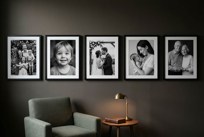
5. The Black-and-White Portrait Wall
This simple layout consists of a clean row or small grid built entirely from black-and-white photographs. It strips a gallery wall down to its most essential element: the people in it.
Why It Works
Removing color means there's one less thing competing for attention. What's left is the people and their expressions, which is usually the actual point of the wall. Photos taken years apart, in different rooms or seasons, suddenly feel connected once they share the same monochrome palette.
Best Photo Choices
Family portraits, wedding photography, and candid moments all work well in black and white. Close-up shots of children are especially effective here, since removing color puts their expression front and center rather than the background or their clothing.
Styling Tips
- Keep the layout itself simple, a row or small grid rather than a scattered cluster, so the photography style stays the focal point.
- Use one consistent frame finish throughout.
- Avoid mixing in any color photos, even one. A single-color image will pull focus from the rest.
The FrameForest Touch
A single frame finish across the layout keeps the focus on the photography. FrameForest's painted black finish deepens the graphic, high-contrast feel these portraits already have. Alternatively, our white frames keep things airier and let the images read as the clear focal point.
6. Fewer Frames, More Presence
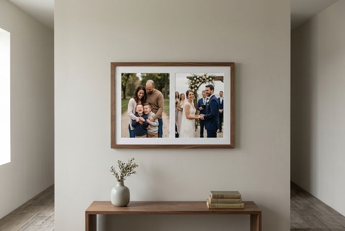
Just a couple of thoughtfully chosen larger photographs prove that a gallery wall doesn't need many pieces to feel complete. This is especially true when there's generous empty wall space left around them.
Why It Works
A meaningful photo or two sometimes have more impact when they aren't surrounded by a dozen others competing for the same attention. Picture a meaningful pair of photos hung in the hallway with nothing else nearby. The empty wall around it isn't a gap to fill. It's what makes the photos feel like cherished moments.
Best Photo Choices
This is the layout for the images that mean the most: a favorite family portrait, a specific wedding or engagement moment, or a milestone shot.
Styling Tips
- Arrange your photos using matching individual frames or group them as a collage within a single frame.
- Choose photos that can stand on their own visually, without relying on neighboring images for context.
- Give the group at least as much surrounding wall space as the frames themselves take up.
The FrameForest Touch
FrameForest's two-photo collage frame is built for exactly this approach. A single frame, two photos, no extra pieces needed to make a minimal gallery wall feel complete.
Which Layout Fits Your Wall Best?
This quick reference will make it easier for you to match a gallery layout to the wall that's actually in front of you.
Layout | Ideal Wall | Typical Frame Count |
|---|---|---|
Same-size grid | Hallways, larger blank walls | 4 or 9 |
One wood tone, mixed sizes | Stairways, mixed collections | 5 to 9 |
Mirrored symmetrical layout | Above a bed, formal spaces | 2 to 4 |
Oversized vertical trio | Above a sofa or console | 3 to 4 |
Black-and-white portrait wall | Living rooms, entryways | 3 to 6 |
Fewer frames, more presence | Narrow hallways, small walls | 2 to 3 |
Tips for Keeping Your Gallery Wall Minimal
An unadorned gallery wall can drift back toward clutter one frame at a time. These habits ensure your gallery wall stays simple:
- Start with a plain or neutral wall color. Even a perfectly restrained layout can look busy against a patterned, wallpapered, or brightly colored wall.
- Stick to one frame type for the entire wall. Mixing wood tones with painted frames or having frames of different widths undercuts the cohesion minimalism depends on.
- Give every frame generous, even spacing. Crowded frames read as cluttered no matter how simple each individual piece is.
- Choose photos with a shared tone or color story. This is true even if the subjects vary. A consistent visual thread does more for cohesion than any layout choice.
- Step back and view the wall from across the room before finalizing anything. What looks sparse up close often looks exactly right from normal viewing distance.
A Calmer Wall, Not a Smaller Story
A minimalist gallery wall can still display your most precious memories effectively. It just comes down to a more intentional layout and more consistent framing. Whether it's a same-size grid, a mirrored arrangement, or just two large pieces with room to breathe, the goal stays the same: let the photos and the frame quality speak for themselves.
FrameForest's solid wood frames, from walnut, maple, and oak to painted black or white finishes, make it easy to build a clean, calming gallery around real family photos. If it's time to simplify a wall at home, FrameForest's collection is a great place to start.
FAQs
What exactly is a minimalist gallery wall?
A minimalist gallery wall is a curated display built from a smaller number of frames, consistent finishes, and generous spacing, rather than a densely packed arrangement. The goal is to let a few meaningful photos stand out instead of competing with dozens of others.
What makes a picture frame minimalist?
A minimalist picture frame has clean lines, no ornate detailing, and a slim profile that doesn't compete with the photo. Solid wood in a single, consistent tone is one of the most reliable ways to achieve that look without it feeling stripped-down or plain.
How many frames should a minimal gallery wall have?
There's no fixed number. It can be as small as two frames or as structured as a nine-square grid. What matters more than the count is consistency in finish and generous spacing between pieces.
What's a simple gallery wall layout I can try first?
A same-size grid arrangement is one of the most forgiving and simplest gallery wall layouts to start with. Every frame is identical, and the spacing follows a predictable pattern, which removes a lot of the guesswork.
Do all the frames need to match?
Not exactly, but they should share a consistent finish or material. Frame sizes can vary, as in the mixed-size wood-tone idea, as long as the tone stays the same throughout. This helps keep a mixed arrangement from reading as mismatched.
How can I prevent my gallery wall from looking cluttered?
Stick to one frame finish, use even spacing throughout, and resist the urge to add extra pieces once the arrangement feels complete. A plain or neutral wall color behind the display also makes a noticeable difference.
References
Roster, C. A., Ferrari, J. R., & Jurkat, M. P. (2016). The dark side of home: Assessing possession “clutter” on subjective well-being. Journal of Environmental Psychology, 46, 32–41. sciencedirect.com
Lumen Learning. (n.d.). Gestalt principles of perception. courses.lumenlearning.com