


 ChatGPT
 Gemini
 Perplexity
 Claude
 Grok

You hang a favorite photo, step back to admire it, and spot the window reflected right across it. From the sofa, it looks great. But from the doorway? Basically a mirror.
That little moment is why print finish matters more than most people expect. Glossy and matte each have real strengths, and neither is the safe default. So, when it comes to glossy or matte photos for framing, the right choice depends on the photo, the frame, and the light in your space.
In this guide, “photograph finishes” refers to paper prints, since canvas finishes work differently. By the end, you’ll know which finish works best for the light you actually live with.
Glossy or Matte Photos for Framing: How the Finishes Differ
The difference between matte and glossy prints starts at the surface.
- A glossy print has a smooth, shiny coating that bounces light back in a sharp, mirror-like way.
- A matte print has a flatter, slightly textured surface that scatters light in every direction instead.
That one change shapes how color, contrast, and reflections behave on your wall.
Gloss tends to make color look saturated, and blacks look deep. Imaging benchmarks treat a black density (Dmax) of about 1.7 as good for matte and 2.0 as good for glossy [1].
So in a matte photo vs. glossy photo showdown, gloss often wins on punch, while matte brings a softer, more painterly mood. What matte gives up in contrast, it makes back in a surface that stays easy to read when light hits it.
Here’s a quick side-by-side of how the two finishes compare:
| Glossy | Matte |
|---|---|---|
Surface | Smooth and shiny | Flat, slightly textured |
Reflections | Sharp, mirror-like | Soft and scattered |
Color and contrast | Saturated, high punch | Softer, more muted |
Black depth | Deeper | Slightly shallower |
Best light | Dim or controlled | Bright or changing |
Why Glare Happens and How Print Finish Changes It
Glare is simple physics with lousy timing. Any smooth surface bounces back light from a window, lamp, or ceiling fixture. A glossy surface returns it as a sharp reflection you can spot from certain angles. A matte surface breaks it into a soft haze that keeps the image readable from across the room.
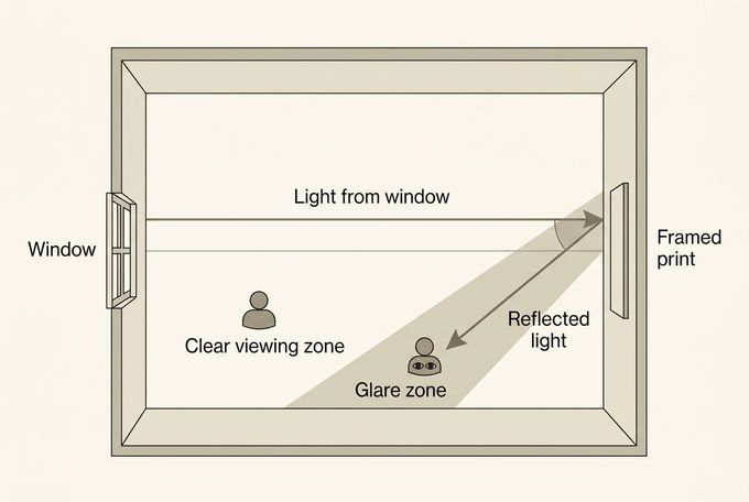
Don’t expect matte to work miracles, though. A bright window directly opposite the frame can still wash out a matte print, and a glossy print in a dim hallway can look flawless. Finish and light work as a pair.
Fingerprints, Dust, and Everyday Handling
Here’s the everyday difference you’ll notice first. Gloss tends to show everything: fingerprints, dust, and scratches all stand out against that shiny surface. Matte is usually more forgiving, although skin oils can still leave a mark on a flat one.
Handling matters most before framing, so hold prints by the edges and wear powder-free nitrile gloves with glossy ones. Once a print is on the wall, it rarely gets touched, and the whole question fades into the background.
When Glossy Prints Make the Strongest Case
Glossy prints reward a little planning. Put them where you control how light reaches the surface, and they pay you back with real depth.
1. Vivid Travel and Sunset Color
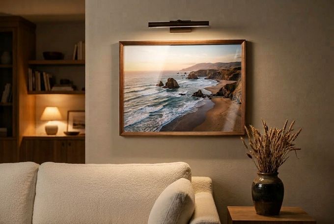
Tropical plants, coastal sunsets, and travel shots look especially rich on a shiny surface, because bright color sits right beside deep darks. Aim a focused light from the side or above so the highlight lands on the wall instead of in your eyes. A natural oak or walnut frame echoes the outdoor subject nicely.
2. High-Contrast Black and White
Graphic black and white with bold shadows suits gloss, since the finish keeps blacks dense and highlights crisp. Light it from above with a directional source, and try a black frame for a touch of drama. Prefer soft, subtle grays? That’s matte territory, so let the mood make the call.
3. Crisp Food and Still-Life Detail
Food, ceramics, and tabletop still lifes pick up extra sparkle in fine detail on a glossy surface. Pair them with a white frame for a clean, contemporary look, and hang them away from a direct window so the shine works for you.
When Matte Prints Make the Strongest Case
Choosing matte or glossy photos for walls that deal with lots of light and foot traffic? Matte prints are the more forgiving option.
1. Bright Rooms With Big Windows or Skylights
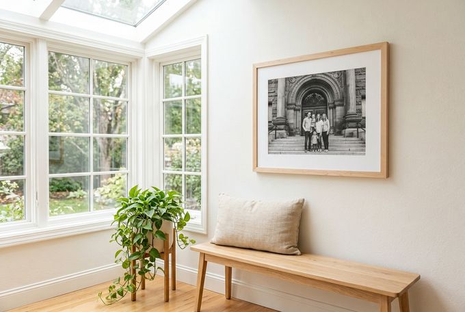
Sunrooms, kitchens with big windows, and skylit hallways throw light at a frame all day long. A matte surface scatters it, so family portraits and lifestyle shots stay easy to see as the sun moves around. Oak, maple, or white frames keep the whole look airy.
2. Quiet Black and White and Fine Art
Soft gray tones, fine art, and moody monochrome portraits invite close looking. Matte lets you study every detail with no reflections in the way, and a white mat with a black or white frame adds a gallery feel.
3. Interiors and Architecture
Photos of rooms, buildings, and staircases feel calm and composed on a matte surface rather than loud. They suit calm, minimal walls, and they hold up in busy spots like stairway gallery walls, where people see the frame from lots of angles.
Where FrameForest’s Silk Paper Fits Between the Two
At FrameForest, we take the guesswork out of choosing between glossy and matte finishes.
Keep in mind that our finish isn't true high gloss or a fully flat matte if that's what you're after. What you can shape is the frame finish, a Standard or Oversized mat or no mat, and an optional acrylic overlay.
Our solid wood frame choices can help you match the look to your room, and custom picture frames bring it all together.
How Glazing Affects Glare Separately From Paper Finish
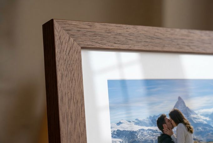
Glazing is the clear layer over a print, and it handles reflections on its own terms, whatever the paper.
- Standard non-glare glazing is etched on one side to scatter light, which can look hazy unless it sits right against the artwork.
- Coated anti-reflective glazing cuts glare without the same loss of clarity [2].
Either kind can reduce reflections but won’t erase them, so placement still matters.
FrameForest’s optional acrylic overlay on picture frames is 0.8 to 1 mm thick and shatter-resistant, with UV protection and museum-grade clarity. It isn’t sold as an anti-glare layer, so paper finish and lighting stay your main tools against glare. And since UV-filtering glazing doesn’t block all UV light, it’s smart to keep prints out of direct sun [2].
Can You Mix Glossy and Matte on One Wall?
Yes, you can, as long as something ties the wall together. Keep one thread constant, like the frame finish, the mat width, or the frame sizes, so the mix reads as intentional. Too many variables at once, say two finishes plus three frame colors, can make a wall feel busy.

Choosing the Photo Finish That Fits Your Room
So, is glossy or matte better for framing? Light decides first, and the photo second. Glossy prints suit darker, controlled rooms and bold, high-contrast images. Matte prints suit bright rooms, busy hallways, and quiet, subtle images. Before you commit, stand where you usually view the print and see what reflects in it. That two-minute check beats any rule of thumb.
At FrameForest, the choices you control are the frame finish, mat options, and an optional acrylic overlay. Custom picture frames let you build the look around the light in your room, so your favorite photo is easy to enjoy from wherever you stand.
FAQs
Is glossy or matte better for framing?
It depends on your room’s light and your photo. Glossy prints shine in dim, controlled spaces with bold, high-contrast images, while matte prints are easier to live with in bright rooms and busy hallways. At FrameForest, photos are printed on silk paper, so the levers you can adjust are frame finish, a white mat, and an optional acrylic overlay.
Does FrameForest print on glossy or matte paper?
Photos are printed on Premium Silk Cover paper (270 g/m²), which has a smooth texture and a soft sheen that reduces glare while enhancing color vibrancy. Think of it as sitting between a mirror-like gloss and a fully flat matte.
Which finish suits a wall that gets direct sun?
When you’re choosing matte or glossy photos for walls near windows, matte is usually more forgiving as the light shifts through the day. Direct sun can still wash out any print, though. UV-filtering glazing doesn’t block all UV, so it helps to hang prints out of the sun’s path where you can [2]. FrameForest’s optional acrylic overlay adds UV protection on picture frames.
Do glossy prints always look more vivid than matte?
Often, but not always. Gloss tends to render deeper blacks, which gives images extra punch [1]. Still, the photo itself and the lighting matter just as much. FrameForest’s silk paper is designed to enhance color vibrancy with a soft sheen rather than a mirror-like one.
Does an acrylic overlay change how much glare you see?
Any clear layer can reflect some light, so an overlay won’t make glare vanish. FrameForest’s optional overlay on picture frames offers UV protection and museum-grade clarity, but it isn’t an anti-glare layer. Lighting and placement still matter.
References
Imatest LLC. (2024). Dmax – Maximum Density. imatest.com
Canadian Conservation Institute. (2019). Glazing materials for framing works on paper (CCI Notes 11/3). Government of Canada. canada.ca