ChatGPT
 Gemini
 Perplexity
 Claude
 Grok
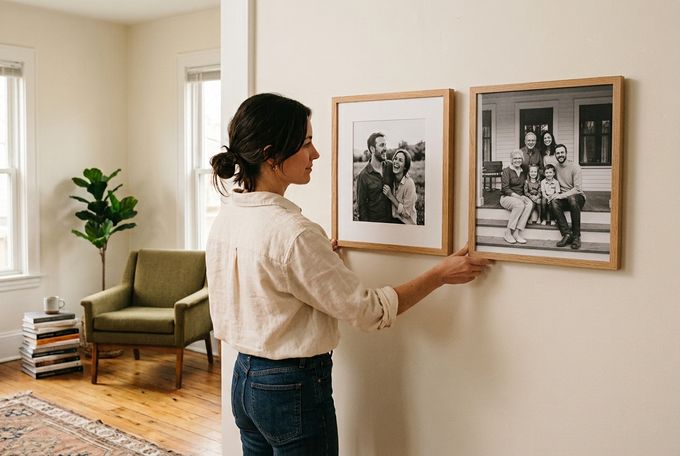
Every framed photo eventually raises the same quiet question: mat vs. no-mat framing? There's no single right answer, and there doesn't need to be one. Museums and galleries hang both, often side by side in the same room, depending on what a specific piece needs from its presentation.
This guide breaks down what a frame mat is, how full-bleed frames differ, and the scenarios where one clearly works better. It also explores frame material recommendations and arrangement advice to ensure your wall art looks its best.
What Is a Frame Mat, and What Are Your Options?
A frame mat is the border of card stock that sits between a photograph and the frame's inner edge, tucked just beneath the glazing or overlay. You may also hear the terms “matted frame,” “frame mat border,” or “passepartout,” which all refer to the same thing.
Common Mat Styles
A few mat variations show up across framing, from big-box stores to museum workshops:
- Standard bevel-cut mat: A clean, angled-edge opening around the photo. This is the most common style.
- French mat: A decorative inked line traced around the opening, often seen in museum and gallery framing.
- V-groove mat: One or more fine incised lines cut into the mat itself, adding subtle texture without color.
Mat Sizing Options
In general framing, borders tend to fall into a few camps:
- Narrow (under 1 inch): These are tight and understated, but borders this slim can feel cramped.
- Standard (1–2 inches): The sweet spot for most photos. It offers enough breathing room without overpowering the image.
- Wide/museum-style (2–4 inches): A bolder, gallery-feel border that draws the eye inward. It works especially well with smaller prints in larger frames.
At FrameForest, mat sizing is kept simple and photo-proportional rather than fixed in inches. There are three options to choose from:
Option | Border Width | Best For |
|---|---|---|
Standard | 10% of the photo's shortest side | Everyday portraits, family photos |
Oversized Museum | 20% of the photo's shortest side | Gallery-style displays, statement pieces |
Full-Bleed (No Mat) | None | Minimalist, edge-to-edge look |
Why Choose a Mat?
A mat isn't just decorative, and it earns its place in a matted vs. unmatted frame decision for a few concrete reasons:
- Protects the print: The mat creates a physical gap between the photo and the overlay, which stops moisture from getting trapped against the surface. It also keeps the print from sticking to the glass or acrylic over time.
- Increases perceived scale: A small photo can fill a large frame without looking lost inside it. This is useful for an oddly sized print or a wall spot that needs more visual weight than the image alone provides.
- Gives the eye somewhere to rest: The blank border works like a pause before the image itself, helping busy or high-contrast photos feel calmer on the wall.
- Unifies mixed collections: A consistent mat width across different photo sizes ties a group of frames together, even when the frames or photo eras vary quite a bit.
- Suits smaller or older prints especially well: Vintage snapshots and compact formats often benefit most from the extra border, since it gives them a presence they wouldn't have on their own.
Why Choose Full-Bleed (No-Mat) Framing?
Then there's your second option: not to use a mat. Full-bleed framing, where the photo fills the entire frame with no border, comes with its own clear set of advantages:
- Makes a bolder, more contemporary impact: Without a border, the photo reads as one complete graphic object rather than a smaller image floating inside a larger one.
- Suits smaller spaces: A full-bleed frame stays close to the photo's actual size, which helps in tighter wall spaces where a wide mat would otherwise eat up valuable room.
- Showcases dramatic, oversized prints: Scale and color can do the work without a border competing for attention, which suits large statement pieces particularly well.
- Built for grid layouts: Repeated full-bleed frames read as one intentional block rather than a scattered mix, which is exactly why many gallery wall layouts favor this look for photo series.
Naomi Scott-Dunne, Creative Director & Interior Designer
Best Use Cases for Matted Framing
Some photos, spaces, and home decor styles call for a mat more clearly than others.
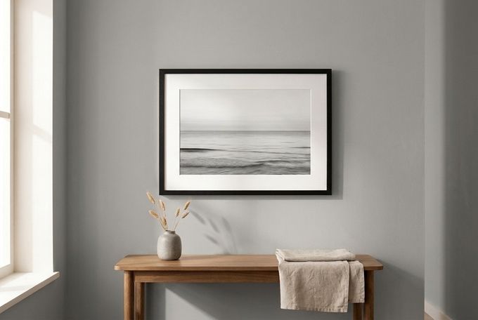
1. Landscape and Seascape Photography
A wide landscape or seascape shot can feel like a quick snapshot without room to breathe. A mat gives it presence and turns it into a considered piece rather than something pulled straight off a phone.
Why It Works
The mat's negative space slows the eye down before it reaches the image. This allows the horizon, light, and color in the photo to carry more weight than they would in a tighter, edge-to-edge crop. It also gives the piece a slightly more formal, gallery-like presence, which suits landscape photography particularly well.
Photo Styles
- Wide landscape or seascape photography
- Architectural and travel shots
- Black-and-white nature photography
Frame Recommendations
A black or solid wood frame paired with a standard-width white mat keeps the focus on clarity and light. Orient the piece horizontally to reinforce the sense of space the photo is already working to create.
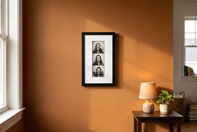
2. Small and Nostalgic Prints
Photo-booth strips, passport photos, and small vintage snapshots often get lost in a standard-sized frame. Oversizing both the frame and the mat around a tiny photo, such as a black-and-white photo-booth strip, turns it into a deliberate feature instead of an afterthought.
Why It Works
The generous mat gives a small image enough visual weight to hold its own on the wall. Opting for a black or dark wood tone helps to reinforce a photo's classic feel. Alternatively, an off-center opening or a bolder frame color can add a playful energy to prevent it from feeling too formal.
Photo Styles
- Photo-booth strips
- Passport-style portraits
- Small-format vintage snapshots
Frame Recommendations
Size the frame and mat well beyond the photo itself for the most impact, since the extra space is what gives a tiny print its presence. A black or walnut finish works best here, letting the wide mat carry most of the visual weight.
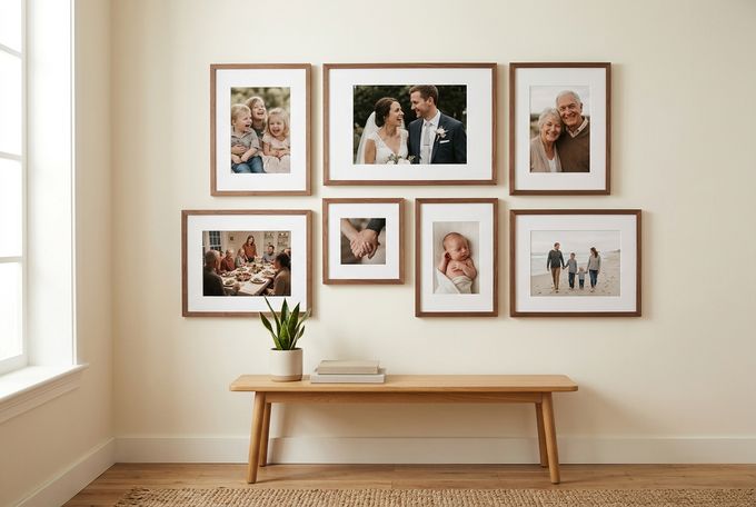
3. Mixed-Size Gallery Walls and Family Timelines
A gallery wall built from photos of different sizes and eras can look chaotic fast. Keeping one consistent mat width across every frame is the fix, whatever the photo sizes underneath happen to be.
Why It Works
A shared mat width creates rhythm across the wall, so the arrangement reads as one considered collection instead of a random mix of frame sizes. This matters more as a collection grows, since new photos can be added later without throwing off the overall balance.
Photo Styles
- Family portraits across different years
- Milestone and life-event photography
- A mix of close-up and full-scene shots
Frame Recommendations
When choosing frame materials, opt for one consistent wood tone and one matching mat width across every frame in the collection, regardless of how much the frame sizes themselves vary.
Best Use Cases for Full-Bleed (No-Mat) Framing
Other photos and spaces are better served by skipping the mat entirely.
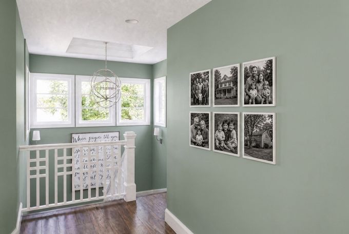
1. Hallway and Stairwell Photo Grids
Narrow hallways and stairwells suit a tighter, more graphic approach. A grid of full-bleed, black-and-white photos feels intentional rather than cluttered in a space people tend to pass through quickly.
Why It Works
Repetition and consistent spacing turn a narrow space into a deliberate, gallery-style feature instead of a random collection of photos. Skipping the mat keeps each frame compact, which matters in a hallway or stairwell where wall space is often at a premium.
Photo Styles
- Black-and-white photography
- Travel or architectural shots
- Candid family moments with a documentary feel
Frame Recommendations
Size the grid to the space, whether that's a tighter 2x3 arrangement or a fuller 3x4 layout, and keep every frame in the same finish. That consistency is what makes the grid read as one considered feature rather than a random assortment of photos.
2. Home Theaters and Poster Displays
Vintage film posters and motion-blur photography already carry their own visual texture. A mat can feel too formal against that gritty, cinematic mood.
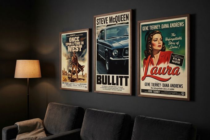
Why It Works
Posters and motion-blur prints often already have some form of border, so an added mat becomes redundant rather than helpful. Full-bleed framing also keeps the focus on the print's atmosphere and color instead of introducing a bright white border into a deliberately dark, moody room.
Photo Styles
- Vintage film posters
- Motion-blur or gritty documentary-style prints
- High-contrast black-and-white event photography
Frame Recommendations
A black or dark walnut frame suits the theater's moody ambiance well. If displaying more than one piece, keep the frame finish consistent across all of them so the wall reads as one cohesive display rather than a mismatched collection.
3. Oversized Statement Pieces
A large, dramatic print, or a triptych (three-piece picture grouping), rarely needs a mat. Adding one to an already-big piece can dilute its impact rather than enhance it.
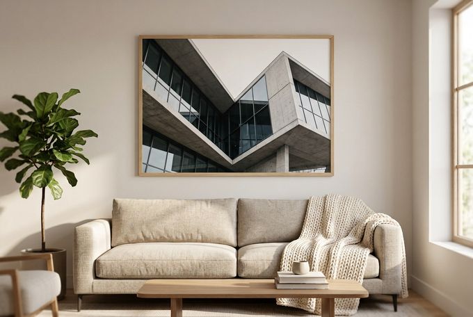
Why It Works
Letting the print's own scale carry the room keeps the piece feeling intentional instead of overworked, especially when the frame itself stays simple and quiet. A mat on a piece this size can also visually shrink the image, which works against the whole point of choosing something oversized in the first place.
Photo Styles
- Large-scale landscape or architectural prints
- Statement pieces meant to anchor a room
- Bold, high-contrast photography
Frame Recommendations
A simple, natural wood frame works well here, with oak or maple in particular staying quiet enough not to compete with a large image. Keep the profile thin, so the frame reads as a clean edge rather than a design statement of its own.
Additional Advice on Getting the Details Right
A few smaller decisions affect the final result just as much as the mat-or-no-mat choice itself.
1. Pick a Mat Color That Ages Well
Mat color affects how warm or dated a photo feels, not just how it's framed. A stark, bright white mat can make black-and-white photos look sepia-toned by comparison, aging them before their time.
A cleaner, neutral white is the safer default, since it stays versatile across wall and decor styles and doesn't compete with the photo's own tones.
2. Print Quality Matters Even More Without a Mat
Since a full-bleed frame has no mat to soften the transition to the frame's edge, image quality carries more of the visual weight. Higher-resolution source files matter more here, especially for larger prints, since any softness at the edges has nowhere to hide [1].
3. Mixing Matted and Full-Bleed Frames on One Wall
Combining both styles on one gallery wall can also work well when done correctly. Consistency comes from spacing rather than making every frame match. A few guidelines to keep the mix looking deliberate:
- Keep a uniform gap of roughly 2 to 3 inches between every frame
- Choose one piece to anchor the arrangement visually
- Lay the full layout out on the floor before hanging anything
- Use a level and tape measure rather than eyeballing it
There's No Wrong Answer, Just the Right Fit
The better choice in the mat vs. no-mat framing decision comes down to the photo, the room, and the mood you're after, not a fixed rule.
A mat suits a treasured older photo, a small nostalgic print, or a mixed-size gallery wall. On the other hand, full-bleed framing lets an oversized, graphic, or high-contrast print speak entirely for itself. Neither option is more "correct"; they simply solve different problems.
FrameForest's configuration tool makes this easy to test. You can easily try out our no-mat, standard-mat, and oversized-mat options directly on our product pages.
FAQs
What exactly is a frame mat?
A frame mat is the border of card stock placed between a photograph and the frame's inner edge, sitting beneath the glazing.
Does a mat actually protect a photo, or is it just decorative?
It does both. Beyond finishing the look of a framed piece, a mat creates a physical gap between the photo and the glazing. This helps prevent moisture damage and stops the print from sticking to the glass as conditions change over time [2].
Should I mat a photo myself, or is it better handled professionally?
Knowing how to mat a photo properly takes practice, since keeping proportions and bevel angles consistent isn't easy to get right with a basic mat cutter at home. For most people, ordering a photo with the mat already built in, as with FrameForest's Picture Frames, is the simpler, more reliable route.
Can I mix matted and full-bleed frames on the same gallery wall?
Yes, and it's a common approach for varied photo collections. Keep the spacing between frames consistent, choose one anchor piece, and lay the arrangement out before hanging anything. The mix of styles reads as intentional as long as the spacing stays even throughout.
What mat color works best for black-and-white photos?
A clean, neutral white or off-white mat is the safest choice for most black-and-white photography. A very bright white mat can make the photo itself look dated or slightly sepia-toned by comparison, especially in warmer lighting.
References
HP. (2022, December 22). Large format printing image resolution guide. largeformat.hp.com
Library of Congress. (n.d.). Photographs. loc.gov