ChatGPT
 Gemini
 Perplexity
 Claude
 Grok
Grok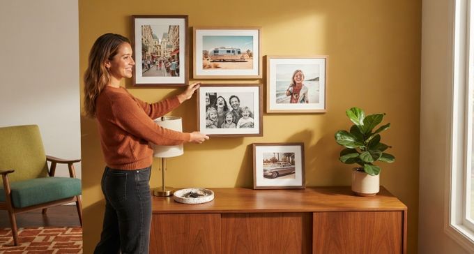
Everyone knows what they love the second they walk into a beautifully finished room, but naming it is the hard part. A home decor style isn't really about a paint chip. It's how the light falls, what materials show up, how furniture sits in a space, and the personal story layered over all of it.
Labels like boho, farmhouse, rustic, and coastal get used so interchangeably that it's hard to tell where one ends and the next begins. This guide skips past the confusion and breaks down six clear, distinct home decor categories, plus the wall art and frame choices that bring each one to life.
What Actually Defines a Home Decor Style?
There are dozens of different home decor styles floating around, but a style is never just about color or furniture alone.
A few things make or break a style:
- Light: The same paint color looks completely different in a north-facing room than it does in a south-facing one, so everything else builds from there.
- Materials and integrity: Real timber, stone, and linen feel different underfoot and to the touch, even if a guest couldn't say exactly why.
- Layout and flow: How furniture sits in a room and how much empty space is left around it shape the mood as much as the objects do.
- Consistency: A style isn't defined by a single hero piece or color, but rather by how consistently that look shows up across the room. When there are too many competing ideas, the room stops reading as any particular style at all.
How Framing and Wall Art Help Define Decor Styles
Once light, materials, and layout are sorted, wall styling with art and framing becomes the final layer. Get it right, and it pulls the whole room together. Get it wrong, and it quietly undoes everything else.
The Impact of Frame Choice
Framing bridges the gap between a room's structure and personal style. Interior designers often lean on the two-thirds rule: a gallery wall should span roughly 60 to 70% of the furniture sitting beneath it [1].
Frames don't need to match exactly, but staying within one tonal family keeps the eye on the art instead of on visual clutter.
That's why the same three frame tones show up time and time again:
Frame Tone | What It Does |
|---|---|
Black | Adds sharp, graphic definition |
White | Lets the wall breathe |
Natural wood | Introduces organic warmth |
FrameForest makes all three options in 100% solid wood. There's no composite or plastic, just real grain doing the work.
The Influence of Wall Art
Subject matter changes a room's feel too. Horizontal landscapes stretch a wall out, and the eye reads them as calming, which makes a compact room feel wider. Vertical portraits pull the eye upward instead, adding structure and a bit of intimacy.
This isn't just a design opinion: environmental psychology research shows that landscape-style imagery actively lowers stress, while structured portraiture sharpens focus [2].
6 Home Decor Styles to Complement Your Aesthetic
With these principles in place, here are six real examples of home decor styles.
1. Scandinavian (Scandi) Style
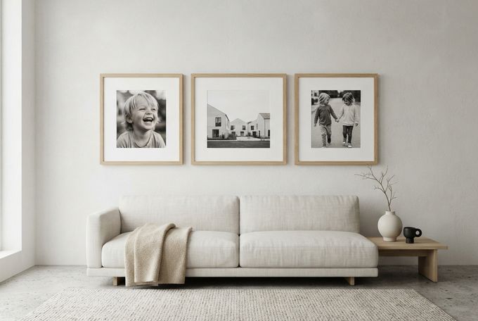
The whole look is built to maximize light in north-facing rooms. Think chalky whites, soft grays, and warm beiges, balanced by black and charcoal accents. Linen and bouclé fabrics, matte ceramics, raw concrete, and light-toned timbers like pale ash and white oak all show up here.
Best For
Calm, minimalist spaces with strong natural light.
Top Frame Choices
Oak or maple gives a light, airy grain, while black or white brings graphic contrast if that's more your speed. A generous mat adds breathing room, and the natural wood grain does the rest of the work, so there's no need for any ornate detailing.
Photos That Work Well
- Candid, close-up shots of kids
- Monochrome architectural landscapes
- Black and white family moments that lean into light and shadow
How to Arrange Them
A minimalist triptych works well for clean lines. You can also try a symmetrical 9-frame grid for visual weight without any of the chaos.
2. Classic English Heritage Style
Drawing on traditional-style home decor, classic English heritage is layered and historical with a touch of eccentricity to avoid feeling dowdy.
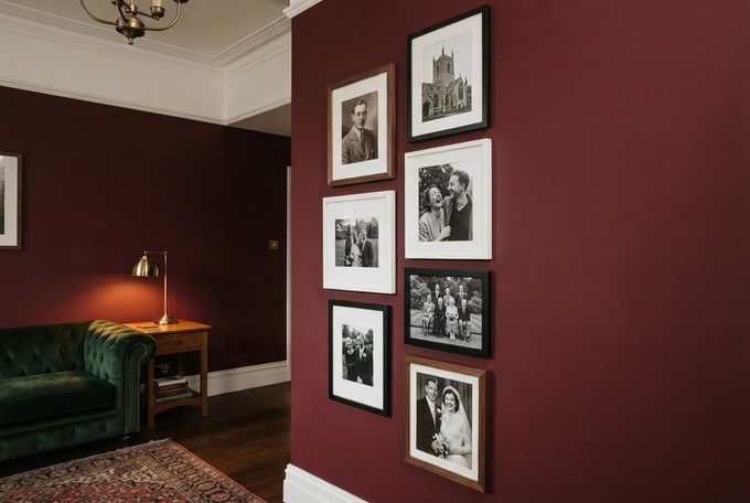
Dark green, navy, burgundy, and warm ochre set the palette, softened by antique-white woodwork. Velvets, tartans, and linens sit alongside ornate plaster moldings, burnished brass, marble, and English oak.
Best For
Formal living rooms, stairwells, and entry halls.
Top Frame Picks
Walnut, black, or unexpectedly white all work here, and white is exactly what gives this style its edge. Solid wood frames capture an antique essence through tone and grain alone, with no gilding required. Walnut makes a good anchor tone, since its natural grain variation mimics antique warmth, and mixing in black and white adds depth.
Photos That Work Well
- Formal family portraits
- Classic wedding photography
- Black and white milestone moments like graduations, but never overly posed
How to Arrange Them
An oversized vertical grouping works beautifully, as does a floor-to-ceiling grid. Stacked vertical frames emphasize ceiling height and complement traditional paneling or wainscoting nicely. If you're feeling bold, suspend frames on brass chains over a large distressed mirror for a collected-over-time look.
3. Coastal Style
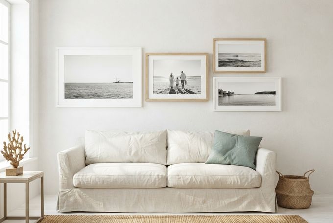
Think farmhouse-style home decor meets airy, maritime freshness. Sun-bleached whites, sandy beiges, and driftwood grays set the base, accented with seafoam green and crisp navy. Slip-covered linens, coarse jute rugs, and shiplap sit alongside unfinished antique brass.
Best For
Sunlit, relaxed spaces and second homes.
Top Frame Picks
Beech, light oak, and maple in natural grain work well, contrasted with black and white. Solid wood keeps the look timeless rather than novelty, and a white mat on a white or oak frame reinforces that clean, coastal feel.
Photos That Work Well
- Sun-drenched family beach moments
- Backs of kids splashing in the surf
- Expansive maritime landscapes, ideally in black and white so they age well
How to Arrange Them
A relaxed horizontal gallery wall suits this style, or try a clustered stack of frames against one wall. Both echo the flat line of an ocean horizon, which makes rooms feel wider and airier. Large horizontal prints, 20x30 or wider, reinforce that horizon effect even further.
4. Mid-Century Modern Style
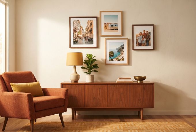
Mustard yellow, avocado green, and burnt orange ground this style, alongside rich teak and walnut tones and a bit of polished brass. Tweed, molded plastics, and terrazzo sit next to sleek, tapered silhouettes, capturing that post-war optimism meeting organic function.
Best For
Living rooms with a warm, retro-functional feel.
Top Frame Picks
Square or elongated rectangular frames in medium-toned woods like oak or walnut work best here, with a minimal mount. A simple solid wood frame in walnut brings out a warm, deep grain, while oak evokes the era's cabinetry without overthinking it.
Photos That Work Well
- Vintage-toned travel photography
- Candid family snapshots
- Saturated, warm-palette color landscapes with a bit of film grain or sepia hue
How to Arrange Them
A staggered, asymmetrical layout suits this style well, or opt for a balanced horizontal grid. Offsetting two frame sizes in an interlocking pattern gives you the playful geometry this style is built on.
5. Japandi Style
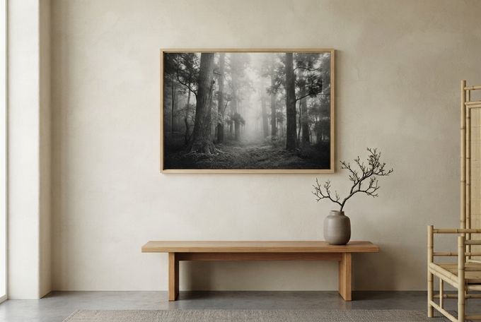
This is where Danish functionality meets Japanese minimalism. Soft oatmeals, warm creams, and charcoal set the tone, with touches of dark mossy green and umber layered in. Matte stoneware, light bamboo, and paper-based finishes all lean on wabi-sabi: the idea that imperfection adds beauty.
Best For
Bedrooms and quiet, unadorned rooms.
Top Frame Picks
Maple, light oak, or black frames work best, while clean, unadorned profiles let the grain speak for itself. Pale, fine-grained wood keeps things soft, while black adds a touch more contrast if the room calls for it.
Photos That Work Well
The art should blend into the room, not shout over it. Consider:
- Quiet, shared human moments
- Close-up children's portraits
- Misty-gray botanical landscapes
How to Arrange Them
One oversized focal frame makes a strong statement here, or try a perfectly balanced pair of two large frames. Japandi walls stay largely unadorned, since negative space carries as much weight as the art itself. A single large wood-framed canvas against a textured plaster wall is a high-impact, low-effort investment.
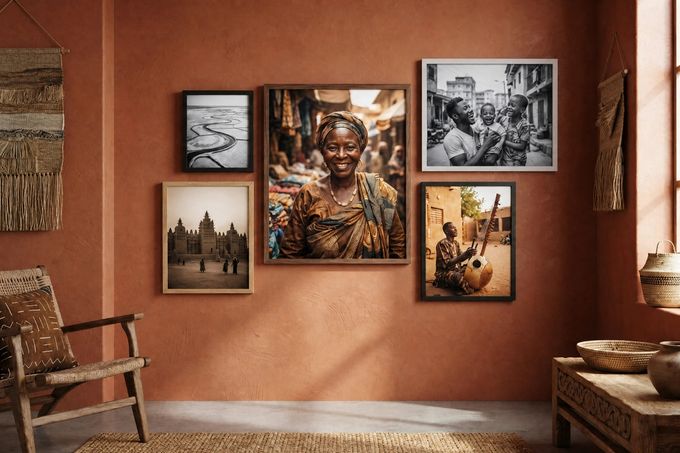
6. Afro-Contemporary Style
This style is rooted in craft traditions and is complemented by eclectic-style home decor pieces. Anchor colors include terracotta, deep ochre, burnt umber, and charcoal, accented with muddy olive. Woven raffia, coarse jute, hand-carved timbers, and textured or polished concrete walls celebrate craftsmanship over factory uniformity.
Best For
Expressive, well-travelled, and maximalist spaces.
Top Frame Picks
Walnut, oak, black, and white all work together here, used in varying sizes for texture and contrast. Walnut brings the most depth and warmth, so it makes a strong anchor tone, while black and white add contrast around it.
Photos That Work Well
- Warm-toned environmental portraits
- Travel photography
- High-contrast black and white landscapes
- Close-up textures like bark, weave, or earth
How to Arrange Them
An asymmetric, organic cluster with varied frame scales suits this style well. It should feel loosely structured and collected-looking, since movement and asymmetry are part of the point. A sepia-toned travel photo in a walnut frame makes a strong anchor piece for the cluster.
Can You Mix Home Decor Styles Without the Chaos?
Blending different types of home decor styles throughout a home is what makes it feel lived-in, rather than lifted straight from a gallery wall layout found online.
Layer in these tricks to keep the mix intentional instead of jumbled:
- 80/20 rule: Commit 80% of a room to one dominant style, and leave 20% for accents to add personality. It's the easiest way to bring order to a space without making it feel sterile or overdone.
- The framing trio: Bridge two styles with one consistent frame palette: black, white, or natural wood. A unified frame family reads as intentional even when the art varies.
- The “red thread": Keep one shared element running through the mix, whether that's a matching wood grain, a consistent neutral, or a recurring color temperature.
How to Refresh Your Home's Look Without Starting Over
You don't need new furniture to make a room feel different. A few small, deliberate changes go a long way:
- Swap the artwork, not the frame: Keep your core black, white, or natural-wood frames and simply change what's inside them. Moving from a colorful landscape to a black-and-white photo changes a room's entire energy without moving a single piece of furniture.
- Rework your 20% accent layer: Leave your larger investment pieces alone and focus on the smaller, swappable details. These include cushion covers, throws, and seasonal textures like a cozy knit in winter or crisp linen in spring.
- Rethink the layout: Pull furniture away from the walls, or angle a sofa toward a favorite gallery wall. Changing the physical flow alters how a room feels to be in.
Find Your Style, Then Let Your Walls Tell the Story
The most memorable rooms rarely come from a trending Pinterest board. They come from photos, colors, and small details that actually mean something to the people living there. That’s what ties all six home decor styles in this guide together: authentic design choices with a bit of personal history.
Once light, materials, and layout are settled, wall art is the layer that finishes the story. FrameForest's solid wood picture frames suit almost every style here, from a Scandi triptych to a stacked English Heritage wall, while framed canvas options bring the texture a Japandi focal piece calls for.
FAQs
What are the different types of home decor styles?
There are dozens, but the styles covered in this guide (Scandinavian, Classic English Heritage, Coastal, Mid-Century Modern, Japandi, and Afro-Contemporary) represent six genuinely distinct directions, each with its own palette, texture, and approach to wall art.
What's the difference between boho and eclectic design styles?
Boho-style home decor leans free-spirited and global. It's built around vibrant colors, natural materials, and pieces that feel collected from travel or secondhand finds. Eclectic decor also mixes eras and origins, but it tends to use a more curated, balanced palette and a stronger sense of structure than boho's looser, more layered approach.
How do coastal designs differ from farmhouse decor styles?
They share some DNA, like natural materials, relaxed silhouettes, and neutral bases, but they land in different places. Farmhouse-style home decor leans rustic and rural, while coastal leans airy and maritime. Plenty of homes borrow a bit from each.
Is vintage the same as antique-style home decor?
Not quite. Vintage styles in home decor usually refer to items or aesthetics from a specific recent-past era, like the mid-century decades. Antique, on the other hand, typically points to something older (over 100 years) or a design that evokes an earlier historical period, like the Victorian era.
Can I combine more than one decor style in my home?
Yes. In fact, most real homes do. The easiest way to blend styles without creating clutter is the 80/20 rule (80% dominant style, 20% accent), paired with a consistent frame palette and a small "red thread" detail that repeats through the space.
References
Gestalt Principles. (n.d.). Gestalt principles: An interactive guide to design psychology. gestaltprinciples.com
Youn, C. H., Kang, M., & Lee, J. (2025). Biophilic design and restorative effects: A neuropsychological study of healthy indoor workspaces in urban contexts. International Journal of Environmental Research and Public Health, 22(10), 1571. mdpi.com